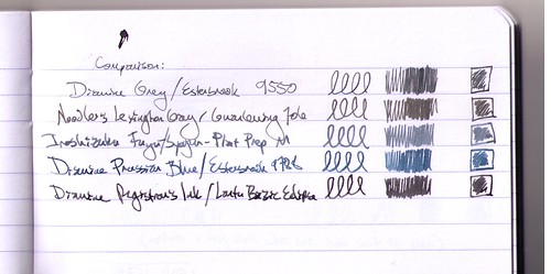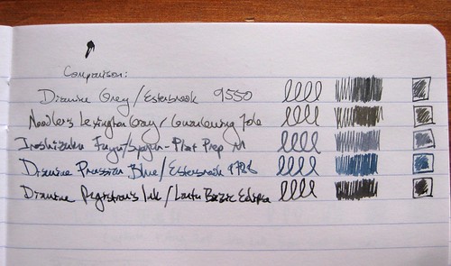
If you've read my blog for a while, you know I keep an ink journal to keep track of all my fountain pen inks. I update it every time I refill or clean a pen, so it's a great record of maintenance, and of course it helps me remember which ink is in which pen! But I also play around in it from time to time, and ink comparisons are always great fun. I had a yen a while back to compare my grey inks - or at least, the grey and blue-grey inks I had loaded in pens at the time.
What you see above is a scan of that comparison.

I also took a photo of the page, in natural light (indirect sunlight), and to my eyes, this one (the photo above) is a far more accurate portrayal of the colors. But some people prefer scans to photos, so in the interest of a full range, I used both imaging options.
I hadn't realized, until I put them all together like this, how very greenish the Noodler's Lexington Gray is.
The inks and pens listed above:
Diamine Grey / Esterbrook 9550 (EF)
Noodler's Lexington Gray / Guanleming 706 EF
Iroshizuku Fuyu-Syogun / Platinum Preppy M
Diamine Prussian Blue / Esterbrook 9788 (M)
Diamine Registrar's Ink / Lantu Bazic Eclipse M
The Registrar's Ink and the Lexington Gray are both waterproof, so they show up on postcards with some regularity. The others are for the innards of a letter or a journal.
Do I have a favorite? I guess I'd have to flag the Iroshizuku Fuyu-Syogun and the Registrar's Ink as current top picks, both for the color and behavior.
For those who are as geeky as I am about this sort of thing, these comparisons are in a Clairefontaine Basics clothbound journal, just like this one I blogged about over a year ago, except the current incarnation has a black cover. I'm pretty happy with using this journal as an ink journal, but when I finish this one, perhaps I'll branch out. Who knows.