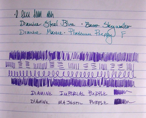
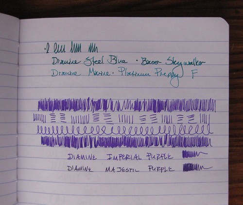
To follow up on that post I did a few days ago on the Diamine inks, here I have photos of them loaded in pens, with the two similar colors next to each other.

The Steel Blue definitely looks darker, deeper, and with more jewel-green undertones. Of the purples, all the scribbles are with Imperial Purple. I did not note the pens for those, either, mea culpa: the Imperial Purple is in a Lamy Vista F, and the Majestic Purple is in an Esterbrook SJ with a 2550 nib.
Yep, they're similar colors! I do like the Majestic Purple, but whenever I see it next to the Imperial Purple, I like the Imperial Purple a lot more.
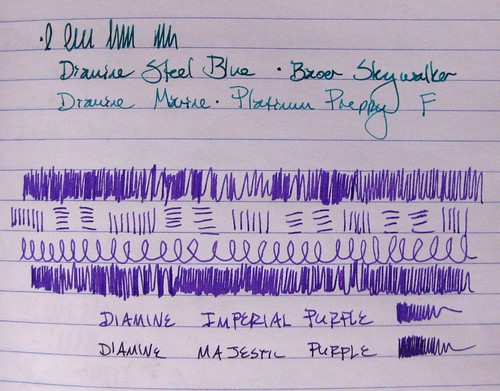
Yes, I do a little bit of levels/color correction in my photos; just for comparison, the above photo is unedited/corrected for light and shading.