Tuesday, March 30, 2010

Diamine ink comparison, in pens

IMG_5785crop

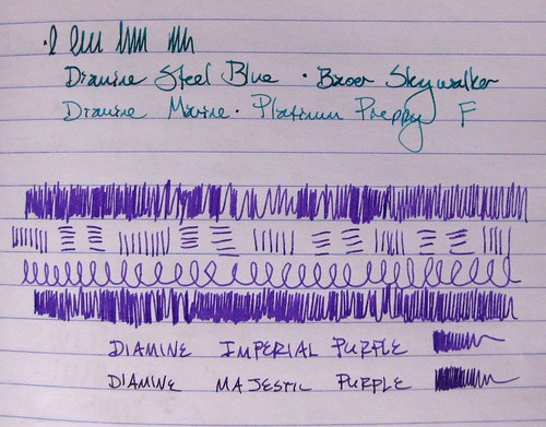
To follow up on that post I did a few days ago on the Diamine inks, here I have photos of them loaded in pens, with the two similar colors next to each other.

IMG_5788crop

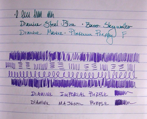
The Steel Blue definitely looks darker, deeper, and with more jewel-green undertones. Of the purples, all the scribbles are with Imperial Purple. I did not note the pens for those, either, mea culpa: the Imperial Purple is in a Lamy Vista F, and the Majestic Purple is in an Esterbrook SJ with a 2550 nib.

IMG_5792crop

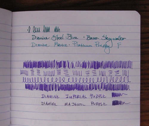
Yep, they're similar colors! I do like the Majestic Purple, but whenever I see it next to the Imperial Purple, I like the Imperial Purple a lot more.

IMG_5792cropNoEdit

Yes, I do a little bit of levels/color correction in my photos; just for comparison, the above photo is unedited/corrected for light and shading.

Monday, March 29, 2010

Three Pilot Iroshizuku Inks

Three Pilot Iroshizuku Ink comparisons, I

Like I said, we'll be on this fountain pen ink theme for a few posts straight, folks. Bear with me.

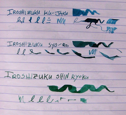
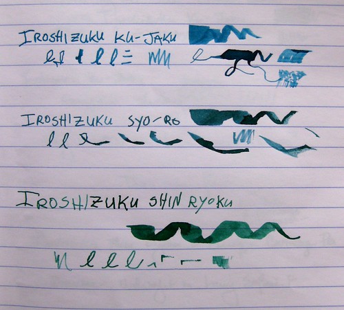
Here are three inks from the Pilot Iroshizuku series. It's a Japanese ink that is rather expensive... some folks think it's overpriced but I've found it's pretty darn fabulous. These are probably my three favorite inks right now. If you've heard me talk ink, you know I really love the fine lines between blue and green: the blue-greens, the green-blues, etc... and I love me a good, rich, dark green. So I am completely thrilled with these three.

Three Pilot Iroshizuku Ink comparisons, II

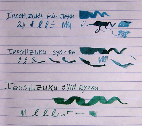
As with other ink photos, I've taken these in natural light from a variety of angles. Photographs do not do this ink justice - it has so much richness and depth, beautiful shading, and it really does look that gorgeous in a pen. I hope to have writing samples from a pen up here someday, but these are toothpick lines just like yesterday's post.

Three Pilot Iroshizuku Ink comparisons, III

These inks are starting to become more widely available in the U.S. (I can't speak for other countries, sorry, except that they come from Japan) but I bought mine from JetPens, one of the first retailers to bring them all over here. I know I've talked about JetPens before - fabulous customer service and incredible shipping rates - free with a purchase of $25 or more in the USA. Wow. Anyway, the colors I have here are as follows:

Ku-Jaku / Peacock (Deep Turquoise)
Syo-Ro / Pine Tree Dew (Dark Turquoise
Shin-Ryoku / Deep Forest Green (Deep Green)

I linked to the product pages because the bottles are so darn pretty, too. Even the boxes are gorgeous.

Most importantly, this is the best-behaved ink I have ever used. Ever. It flows perfectly, and it dries instantly. I have yet to smudge it, even from a wider nib on slick paper like Clairefontaine. Hooray! I love this ink and definitely think it's worth the heftier price tag. I still covet a couple of the other colors, particularly Tsuki-Yo (Night Sky), but those may have to wait a bit...

Sunday, March 28, 2010

Five Diamine inks

5 Diamine inks in ink journal, I

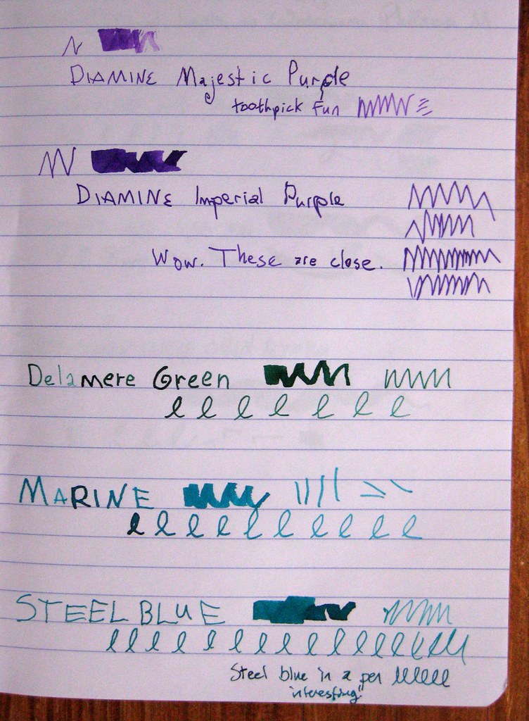
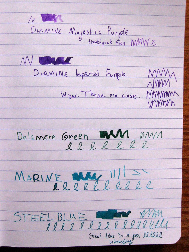
Here we have a very unscientific comparison of 5 fountain pen inks by Diamine: Majestic Purple, Imperial Purple, Delamere Green, Marine, and Steel Blue. They are done with toothpicks in the ink, except that the bottom example of Steel Blue also has a writing sample with the ink in a pen.

5 Diamine inks in ink journal, II

These samples are in my Clairefontaine ink journal, and they were taken with no flash in natural sunlight. I turned the journal three different directions on the table, so you'll see a slightly different angle for the lighting. Some people don't care, but I do - I like to see the subtleties, especially when I'm trying to make judgments on a computer screen.

5 Diamine inks in ink journal, III

Diamine is an English maker of fine fountain pen inks, and I recently purchased a whole passel of smaller 30ml bottles directly from them. Shipping from the UK wasn't all that bad, all things considered, and I like trying out the colors in the smaller bottles. I knew that I'd be getting some similar colors, and I am pretty fascinated by the results of how similar Imperial and Majestic Purple are, as well as Steel Blue and Marine.

The Delamere Green is sort of the odd duck - it's not similar to any inks on the page, but it is a gorgeous dark green with a deep hint of blue.

Warning: I'm about to get geeky about ink, so if you're a general letter-writer reader, you might not dig into this next bit. (Maybe I've lost you already.)

I am really in love with Diamine inks these days. The color variety is beautiful, the saturation is excellent, the shading is almost always pronounced and fabulous, and the behavior is near-perfect: good flow and VERY fast dry time. I've bemoaned the fact before that I am right-handed, but I write like a lefty: I'm an "overwriter" which means that I curl my hand around, and my hand sits on top of the lines I've written above. For a slow-drying ink, this means almost certain smudging unless I place a very careful blotter on top of the paper. With Diamine inks, this is almost never necessary.

In a separate post I will show off Diamine Violet, which I only got as a sample - that is the one bottle I am certain I will buy in a larger size. As for the purples, I have a slight preference for Imperial because it is more blue, and Majestic is more on the pink/magenta end.

I shall almost certainly acquire a larger bottle of Delamere Green.

Marine or Steel Blue? They are just too similar to buy both, but I'm undecided. They behave differently in pens, of course, and I'm just going to have to try them both out in different pens. So far I tend to lean towards Marine, because Steel Blue is so similar to another color I love: Private Reserve Blue Suede.

So many inks, so little time...

Saturday, March 27, 2010

Fountain Pen ink samples

ink samples

Those of my readers who are not fountain pen users may want to sit tight for a while, because I do believe my next few posts will be about ink. Fountain pen ink, that is.

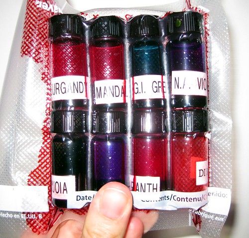
Behold the fantastic ink sampler from Pear Tree Pens. It is a rather brilliant business idea they have - offer teeny tiny samples of bottled ink for a low price. It's a great way for folks to try out a new ink color without buying a whole bottle of the stuff... and if you've played around with fountain pen inks at all, you have discovered that the way it looks on a computer screen is not necessarily the way it's going to look in real life. (In fact, it's gonna look different flowing out of different pens, on different papers! Ah, variety...)

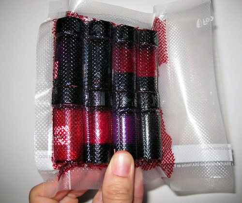
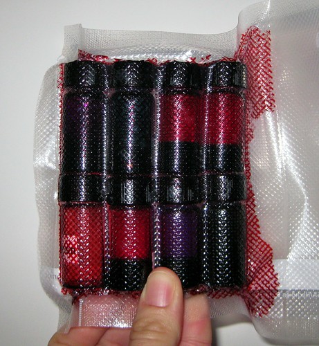
vacuum packed and leak-safe

So here you see my latest purchase - two samplers, which means 8 tiny bottles of ink. They are safely vacuum-packed, which is a good thing, because one of the bottles leaked, and this kept things from being too messy, as you can see from the contained leakage in the photos.

Leaky Lou

In fact, the bottled that had leaked was completely gone and unusable, and Pear Tree Pens showed their typical stellar customer service - they sent me a replacement bottle at no charge, and even threw in three extra samples for free. So I essentially got almost three samplers for the price of two. Thanks, guys!

ink samples, leaked

You can probably also see that you don't get much ink in these samples, so don't expect to fill a big pen that's a piston filler... but I often use a syringe (also from Pear Tree Pens, a la their fabulous Write Fill Cartridge/Converter Fill Kit) and so I can easily test out the ink that way... and I can generally fill a converter or two from the sample bottles also.

I was searching for that perfect shade of burgundy/maroon ink, which I did not find in this sampler or anything else they sent as a follow-up (I am so irked by pinkish burgundies, they are just not for me); I have since discovered that I can achieve a very pleasing burgundy by mixing inks I already have (hooray!), but in this sampler I also learned that I simply MUST have a bottle of Diamine Violet soon.

Friday, March 26, 2010

snaily mail

mail snails

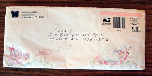
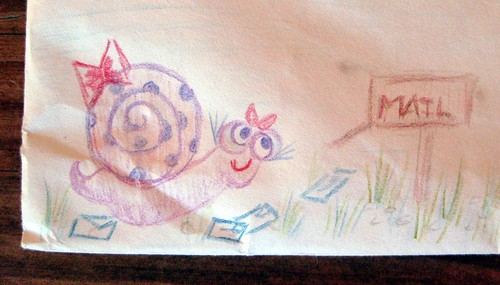
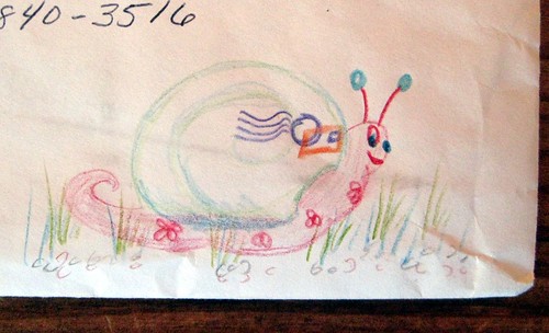
Quite a while back I did a swap on Swap-bot called "Snail Mail :]." I blogged about my own offerings at the time, but did end up responding to one of the swapped envelopes I got.

big snails on the back

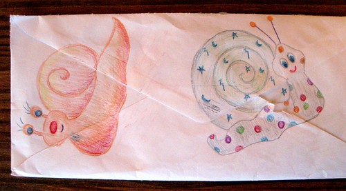
The idea was to decorate the envelope with many snails, and I was really touched by the hand-drawn snails on this one.

mailbox snail

She obviously put some time into her snaily drawings...

mailing snail

...and I found them delightful.

Thursday, March 25, 2010

Mork from Ork vintage postalette

Mork and Mindy postalette

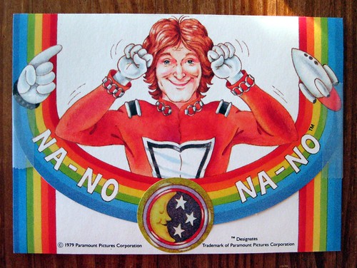
This gem came from a fabulous eBay find (ah, eBay, you are my budgetary downfall): a mint condition, NIB (new in box) set of Mork from Ork rainbow postalettes, from the show Mork & Mindy.

Yes, folks, I remember watching Mork & Mindy as a child - I adored that TV show, and it gave me a lifelong admiration for Robin Williams. This postalette shows Robin Williams in his Mork role, wearing his space suit, and the words are his catch phrase. I'm stumped by the spelling, though, because I recall it sounded like "na-noo" and not na-no. Oh well, discrepancies aside, they're fabulous. The moon and stars sticker came with the original set to seal the postalette, but I gave it a little help with some removable tape.

vintage rainbow Mork and Mindy postalette

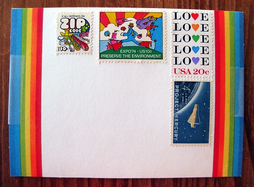
As if these weren't awesome enough, they're covered with rainbows! The rainbow element wraps around the front, on the address side. This one deserved some very cool stamps, so I tried to go with either the rainbow theme or a space theme, to complement the postalette itself. These are some of my very favorite stamps, too. On the left is the "It all depends on ZIP CODE" mail transportation stamp (of course I love the meta mail theme, but the rainbow puffy artwork is delish), in the middle is the Expo 74/Preserve the Environment stamp with artwork by Peter Max, and on the right is the Love stamp with hearts forming the Os in rainbow colors. The Project Mercury stamp is my nod to the space theme.

This was a fun postalette to send and construct; so far I've only sent the one, but I think I've got 11 left. Hmm...

Wednesday, March 24, 2010

March Madness goal reached!

Remember my little March Madness goal to write 100 pieces of mail by April? I just did it! The 100th piece is freshly completed and addressed.

I'm thrilled to have reached my goal in less than 5 weeks - almost a whole week early by the April 1 deadline - and I'm going to go ahead and track the stats until April 1 just for the heck of it. Just for posterity's sake, the stats as of this moment are 63 letters and 37 postcards.

Just had to share the fun news!

(Don't ask me to count the items in my letter pile, though, OK? Because I've probably received just as many as I've written this month...)

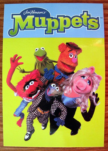
Another Muppets postcard

Muppets postcard

I figured that Sesame Street artwork postcard deserved some Muppets in return, so this is what I sent in response.

Oh, how I adore Muppet postcards...

Tuesday, March 23, 2010

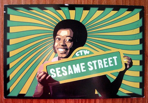
Sesame Street artwork postcard

David of Sesame Street

Awesome psychedelic postcard! This is more original artwork from the artist who has sent me much muppet-licious mail in the past. He did the design of this postcard himself, from a Sesame Street image.

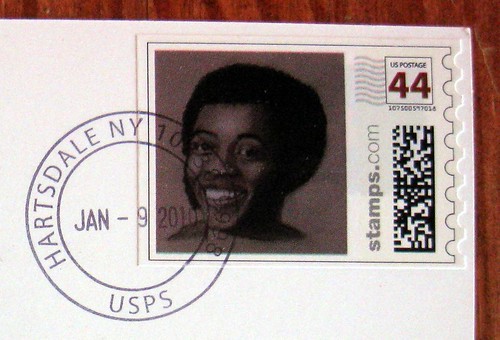
Northern J. Calloway stamp: David of Sesame Street

It features a matching stamp! This is Northern J. Calloway, the actor who played David on Sesame Street.

Thursday, March 18, 2010

Lavender paper, second chance winner!

The original winner of the scented paper giveaway did not respond, and I have no way of contacting them since their profile is blocked, so as promised, I did a second-round, second-chance giveaway (since I had to get to the post office this afternoon). The new winner is Melody! This is absolutely eerie on two levels, because actually commented on my post about the winner hoping for a second chance, AND her original comment entry was #13, which is crazy lucky because that's the second time it's been the winner on my blog giveaways. Wow. Melody, forces are clearly conspiring in your favor. Hope you enjoy the paper!

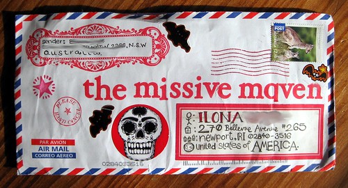
Amazing Australian Airmail

red-licious

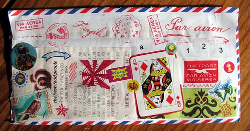
Ms. Goodnight Little Spoon writes such incredible letters. I am spoiled. (Alas, less spoiled than I could be because I fear her latest mail-art marvel sent to me has never arrived, the second piece of blogged-about mail in the past month that I have seen online but not received, argh.) But to focus on the positive of this loveliness - WOW! What a decorated envelope! I love how the q substitutes for an a.

many fine pastings

All kinds of goodness on the back, but of course my very favorite is the gonzo sticker.

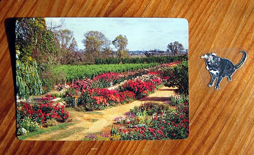
Vintage garden with Tasmanian Devil sticker

These items came from her trip to Tasmania. The vintage postcard is truly lovely, but I confess I've never in my life seen a cooler sticker than this little Tasmanian Devil! Clearly her submissions have won both the coolest postcard AND the coolest sticker awards, all for the little Tasmanian Devil grooviness.

Tasmanian Devil sticker with vintage postcard

I can't even decide how I will ever use this fantastic sticker, so right now he just lives in the side of my clear stamp drawer storage unit, so I can see him looking out at me from the clear plastic. I often look at him when I'm writing letters and he makes me smirk.

Mail joy!!

Wednesday, March 17, 2010

Lavender paper goes to Indigo

We have a winner: congratulations to Indigo, who won the Lavender scented paper giveaway.

However, Indigo does not let me see their blogger profile, so I have no way of contacting this person other than through this blog. And I'm on a schedule - I'm going out of town, and then things get busy again, so I have to send this paper by tomorrow afternoon.

Indigo, if you are reading this, get in touch with me ASAP (my email is on my blogger profile, which you should be able to access) so you can claim your goods.

If I do not hear from Indigo by noon tomorrow (12pm EST on Thursday, March 18) I will consider choosing an alternate winner.

EDIT: Alternate winner has been chosen!

Tuesday, March 16, 2010

Layers of roses

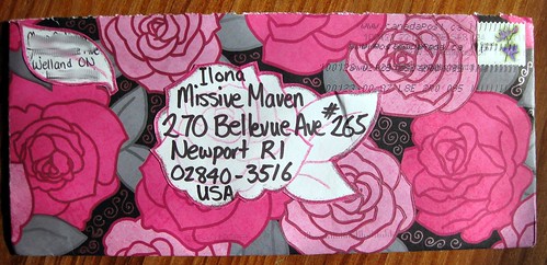
Envelope of roses

Here's a lovely handmade envelope that came in from a blog reader; check out all the details with outlines of glitter (umm, can you see that in the photos?) and metallic gel pen swirlies!

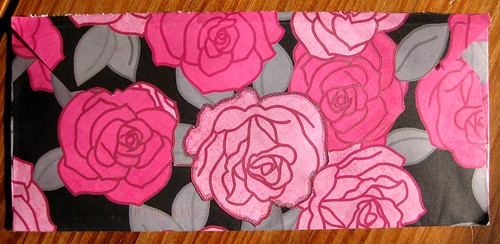
layers of roses

The back flap has various layers of cut-out roses. Lovely!

Paper giveaway reminder

Don't forget the Lavender scented paper giveaway: ends tomorrow at noon.

Sunday, March 14, 2010

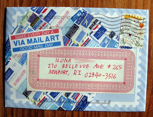
Good mail day from PodPost maven

Good mail day mail art!

I'd love any card from Carolee of Make Every Day a Good Mail Day and PodPost (as in, one of the amazing authoresses of Good Mail Day itself), but this one is particularly meta-mail-alicious.

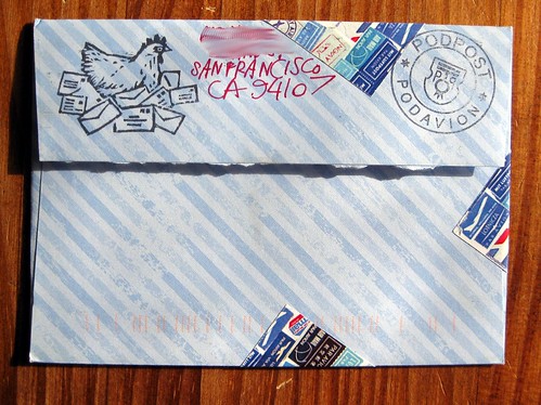
PodPost PodAvion, au poulet

As if the envelope isn't cool enough already, dig that rubber stamp of a chicken on a nest of letters!

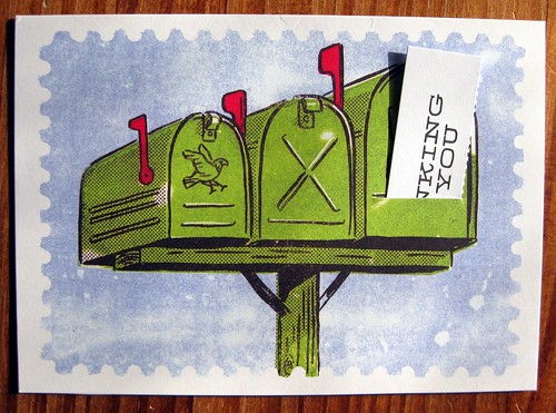
Mailboxy

I am predisposed to like any card with a mailbox on it, and not only did this one have a little slot where you could put in various included sayings, it's also edged to look like a stamp.

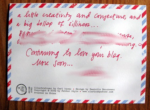
airmail border on back

AND, the back is edged with the postally perfect red and blue airmail border. *sigh of contentment*

brand info

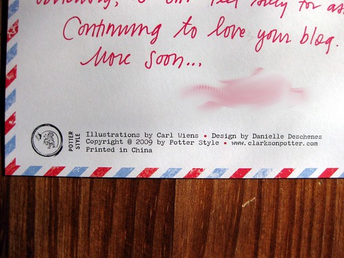
I took a close-up photo of the card info, but don't be thinking you can just whip on that website and find out whatever you want to, because it's a #$^@#%$ division of Random House and deeply ridiculous to navigate. I couldn't find a damn card set, and I know they make a ton. So pooh on you, Clarkson Potter / PotterStyle printed in China / Division of Random House publishing, if your website made more sense (hello, I search for stationery and I get two books and no writing products?) perhaps I would make a purchase. Is this why the publishing industry is in so much trouble?

Sorry, rant there... just really hate bad websites. But back to the cardly goodness - this was such a treat!

{Edit: I do understand how to get around the Random House / Potter Style website, dear readers, and I can find the cards I need to... I was just complaining that the was poorly organized and clunkier than necessary. And so out of spite, I am deliberately not linking them up here. I have received scads and scads of comments telling me how to get to the cards and giving links - I've approved one of them and that's enough. Because it's so much easier to find them on Amazon, though, I'll provide that link for any interested readers.}

Saturday, March 13, 2010

Fountain pen artwork

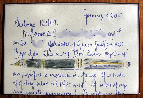
Fountain pen drawing in letter

So, after all these posts about pens... how about a letter with a drawing of a pen? This came to me from a LEX reader after I listed an ad, "do you use fountain pens?" I am LEX 12447 but I blurred out her name and LEX number. Pretty fabulous drawing of a pretty fabulous pen - I was impressed and delighted to receive this one.

My pen case & pens

Pen case, 11 March 2010

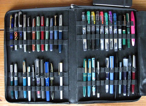
A fountain-pen-loving pen pal asked about my pen case, and wanted to see a photo of it with all my pens. I'm a little hesitant to do this because there's always turnover - it seems as soon as I take a photo, it's out of date. Indeed I took this photo two days ago, and I've already done some maintenance; the three blank slots are filled and a couple of pens now hold different ink. But oh well, the only constant in life is change, eh? Here are the pen models, nib sizes, and what ink they held when the photo was taken on March 11:

Top left, from left:
1. Waterman Phileas M / Noodler's Legal Lapis
2. Waterman Harley-Davidson M orange flames / Noodler's Red-Black
3. Waterman Harley-Davidson M blue flames / Noodler's Pinstripe Homage
4. Waterman Graduate M / Diamine Delamere Green
5. Esterbrook LJ black (Bell System Property) 9788 / Diamine Prussian Blue
6. Esterbrook SJ copper 9284 / Herbin Eclat de Saphir
7. Esterbrook J green 2048 / Noodler's V-Mail Midway Blue
8. Esterbrook LJ red 9048 / Diamine Monaco Red
9. Esterbrook SJ green 9556 / Noodler's Walnut
10. Esterbrook SJ blue 2550 / Diamine Majestic Purple
11. Pelikan M200 Binderized XXXF Needlepoint / Iroshizuku Ku-Jaku
12. Parker 51 EF / Waterman Black

Bottom left, from left:
1. Sheaffer cartridge pen (student pen or school pen? unsure) F / Iroshizuku Shin-Ryoku
2. Waterman Taperite F / Diamine Steel Blue
3. ---
4. Chelpark Moti / Diamine Teal
5. Sailor Ballerie XF / PR Blue Suede
6. Guanleming 706 EF / Noodler's Lexington Gray
7. Lamy Vista F / Diamine Imperial Purple
8. Lamy Safari F / Diamine Midnight
9. Lamy Al-Star EF / PR Ebony Blue
10. Sheaffer WWII-era vac-filler F / Waterman Black
11. ---
12. Sheaffer Agio F / Noodler's Hunter Green

Top right, from left:
1. Platinum Preppy F with converter / Noodler's Pinstripe Homage
2. Platinum Preppy F eyedropper / Noodler's Green Marine
3. Platinum Preppy F eyedropper / R&K Alt Bordeaux
4. Platinum Preppy F eyedropper / Diamine Marine
5. Platinum Preppy F with converter / PR Burgindy Mist
6. Platinum Preppy F with converter / PR Sherwood Green
7. Platinum Preppy M with converter / Noodler's Violet Vote
8. Platinum Preppy F with converter / Noodler's Legal Lapis
9. Pilot Varsity / Noodler's Heart of Darkness
10. Reform 1745 / PR Copper Burst
11. Dollar Student pen / Noodler's V-Mail North African Violet
12. Bic Easy Clic / Diamine Pumpkin

Bottom right, from left:
1. Pilot 78G F / PR Ebony Green
2. Pilot 78G M / Noodler's La Coleur Royale
3. Parker Vector F Sylvester / Noodler's Squeteague
4. Parker Vector M / Iroshizuku Syo-Ro
5. ---
6. Dollar 717 demonstrator / Diamine Violet
7. Autopoint Big Cat M / Iroshizuku Ku-Jaku
8. Sailor Desk Pen EF / Diamine Maroon
9. Sailor Recruit F / Sailor Kiwaguro Carbon Black
10. Sailor Ink Pen (aka School Pen?) / Herbin Eclat de Saphir
11. Pilot Plumix M / mix of Pilot Blue + Noodler's Forest Green
12. Hero 329 / Noodler's Tiananmen
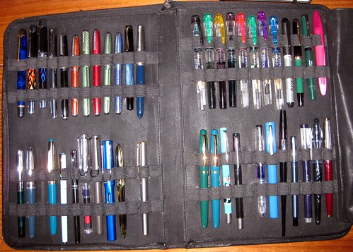
Pen case, 11 March 2010 (with flash)

I like the version without the flash a little better, but here's the flash photo so you can get a different idea of color and such.

I got this pen case on eBay; it holds 48 pens. You can click on either of the photos for a way to get to them directly and maybe see more sizes, if you have a Flickr account.
Friday, March 12, 2010

Rhodia Webnotebook and black Esterbrook: journal & pen spotlight

Esterbrook happiness

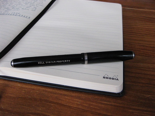
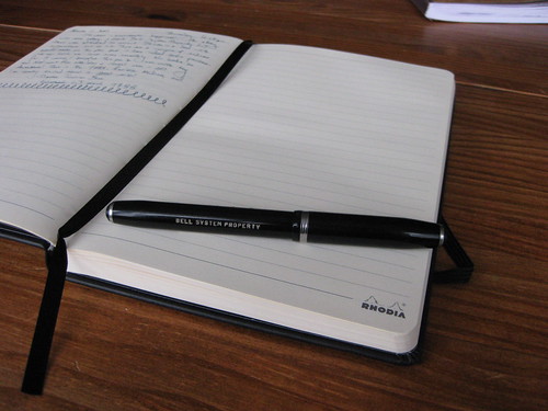
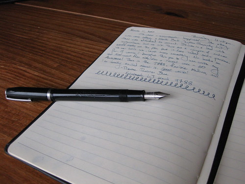
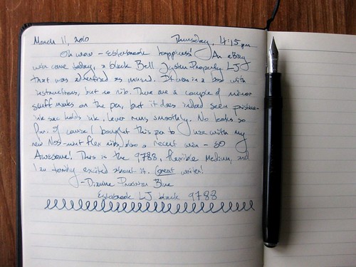
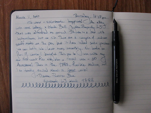
Here's a late-night blog post that is tangentially related to letter-writing, and delves more into my pen-and-ink obsession. This entry features two items I've been coveting for a while, and have finally acquired to my great happiness: a vintage black Esterbrook "Bell System Property" pen (featuring a flexible 9788 nib) and a Rhodia Webnotebook. You'll notice there is no link for the Esterbrook, because these glorious classic fountain pens are no longer made. I am probably not going to go into deep geek level about why the "Bell System Property" pens are particularly desirable in a quirky pen-fanatic way... if you're really curious, you can read about it here. "Estie" lovers will just understand.

sideways nib, no levels adjustment

This post is really for the edification of many of my fountain pen friends, because only a fountain pen lover can really understand the excitement of not only finding THAT pen on eBay, but getting a heck of a deal on it.

BELL SYSTEM PROPERTY

There's the BELL SYSTEM PROPERTY engraving! Ooh la la. These pens were, I gather, ordered en masse for the original Bell telephone company. (I just discovered a big Wikipedia hole - there is no entry for Esterbrook! Egads!) They are somewhat common among Esterbrooks floating around out there, but if one starts falling into the affliction that is known as "collecting" Esterbrooks (and good gravy, methinks I might be on the precipice), one of these pens is pretty much required for your collection. This is an LJ model.

geeking out with the pen shots

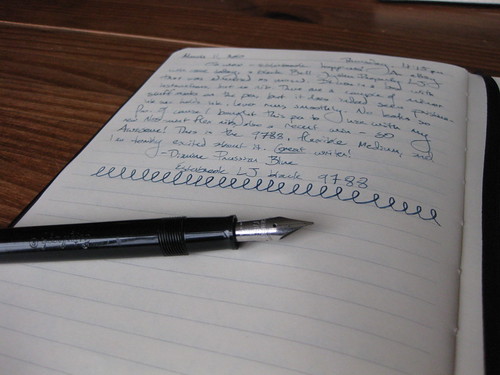
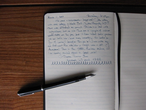
In this fine Rhodia Webbie journal (which I neglected to photograph closed, but you can see it on the Rhodia website), I wrote about the pen, noted the ink (Diamine Prussian Blue), and at the bottom made the squiggly loops to try to demonstrate the medium flexibility of the nib, meaning the tines separate more with greater pressure, creating a wider line. Cooooooool. You can't do that with a ballpoint, people.

Esterbrook & Webbie

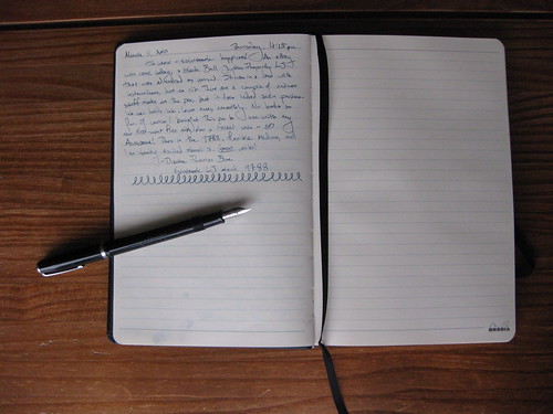
Some people have complained that the Rhodia logo on every right-hand page of the journal is a bit much, and I would probably agree, but I'm really happy with this journal in every other way so I'm not gonna complain. The pages are smooth, a nice light cream/off-white color, and of course they take fountain pen ink beautifully. No bleed-through, no show-through, I can easily write on both sides of the page with no intrusion. This is the A5 size.

penjoy

For the record, I generally do not "post" my pens (meaning put the cap on the end while I write), but I do when I photograph them: the clip keeps the peb from rolling around.

Esterbrook LJ + Rhodia Webnotebook

Right, I know I took a lot of photos, but I had fun. Let me note here that I really like the ribbon bookmark. Just black. Unobtrusive. Classic. Oh, and I left my writing unblurred because it's all about the pen and ink, and I'm happy to share that info with anyone who's interested enough to care.

top shot

Here's a full top shot so you can see all the lines in the journal. I really like that there is a slight margin, the lines don't go all the way to the end of the page; that makes it feel neater somehow. I also appreciate that the very top and very bottom lines are heavier and thicker. Again, a neater appearance.

I guess this is pretty much a review so I'll tag it as such. The Rhodia Webnotebook is everything I'd hoped it would be.

The Esterbrook pen came without a nib, but that's okay because I'd won an eBay auction separately with a bunch of NOS nibs, most of which were flexible. Woo-hoo! I am loving these Esterbrook flex nibs. They are just dreeeeeeaaaaaammmmmmyyyy to write with. I was really pleasantly surprised with this pen, because it was advertised as "unused." I don't know if I believe that, because there are a couple of scuffs on the barrel, but what I care about is the ink sac. These Esterbrooks were manufactured sometime between the late 1940s and the early 1960s. (Experts would know more precise numbers, but I don't.) One doesn't expect the original ink sac to be in pristine condition. Either this pen, which came in a box with the original filling instructions, has a rare pristine ink sac, or someone did a really nice re-sac job. If it is the former, I anticipate I'll have to get it re-sacked one of these days, but that will cost less than 20 bucks and be worth it for an incredible writing instrument.

Thursday, March 11, 2010

Giveaway: Lavender scented paper

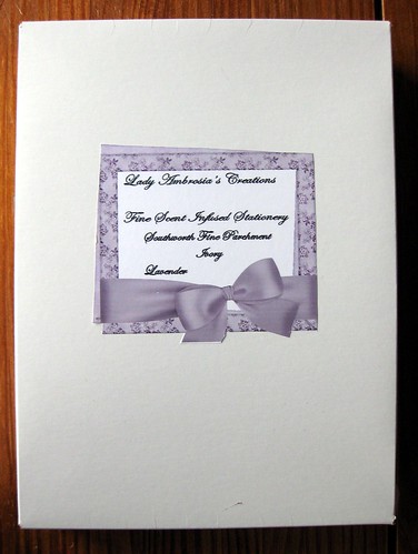
Lady Ambrosia's creations box

I received this fine lavender-scented Southworth Fine Parchment paper as a generous gift from a new pen pal. She didn't ask for a review, didn't ask for anything - just sent me the paper because she thought I might like it. I am just touched by her generosity, but alas... my sensitive nose has gotten the better of me. I'm really sensitive to scents, and it's just touch and go whether I can use any scented product or not. (My experience with the J. Herbin scented inks was atrocious... those will probably show up in a blog giveaway someday soon! I have a "spring resolution" to do more blog giveaways, aren't you excited? :-)
Unfortunately the smell of this paper, while not at all unpleasant, is just too strong for me; I can't enjoy it or review it, but I'd really like to pass it along to someone who might like using it.

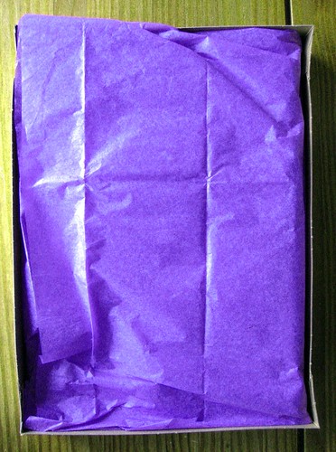
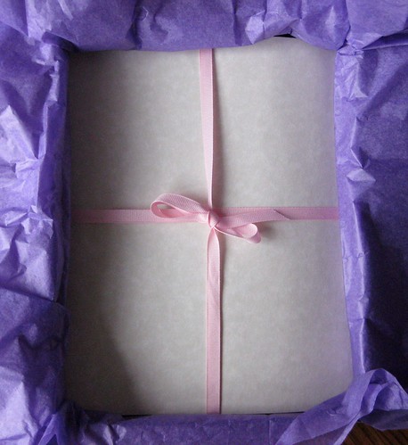
Wrapped scented paper

Those of you who've talked about scented inks not retaining scent, or scented paper not holding its scent... I haven't tested this, of course, but I really think that the fragrance would withstand a journey in the postal service.

Lavender scented parchment paper

Southworth parchment paper is known among fountain pen aficionados as taking ink beautifully, and the paper itself looks very pretty - like old parchment. As you can see, she wraps it up very prettily once it is scented.

For more information on this paper and its creative creator, please visit Ladyambrosiascreations.com or Lady Ambrosia's Creations on Etsy.

THE INEVITABLE RULES

1. To enter the giveaway, leave a comment on this post. One comment/entry per person, please.

2. No anonymous comments will be approved. You need a blogger profile to enter this giveaway (simply because I need to know who you are - I'm not going to count through "anonymous #7"), and if you don't have a blogger profile yet, just make one. It's fast, easy and free, doesn't require a blog, and I think only requires a valid email address.

3. Sorry about this one, but weight and size restrictions mean I can only send this domestically: U.S.A. addresses only, please.

4. The deadline for comments/entries is 12pm (Eastern Standard/NYC time) on Wednesday, March 17, when I will choose a winner (most likely with a random number generator).

EDIT: WINNER = INDIGO! I need your address.

Wednesday, March 10, 2010

New cat stamps from Poland


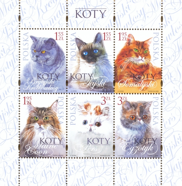
Thanks to the wonderful ModernCat blog newsletter (yes, I admit it, I'm a fan), I just learned about these amazing new Polish cat postage stamps!

Zowie, I don't regularly correspond with anyone in Poland, but I certainly would love to see one of these babies on a piece of mail.

I wish the US Postal service would do another cat stamp! It's been a while. You can have a look at this link to the Polish postal service's website where you can buy the stamp, but of course it's all in Polish.

Monday, March 8, 2010

More on the Letternet saga

I don't have any fancy photos at the moment, but I just wanted to update my faithful readers on the continuing Letternet saga. In my original post, I mentioned the penpal service of the German postal service (Deutsche Post) called Letternet. You can read my previous posts - oh-so-handily linked right here for your convenience - to catch up on the saga, but I do have a couple of recent developments.

So far I've received two letters from Letternet. I wrote one letter to the only pen pal I requested who approved my address request, and she wrote back very swiftly. Her English is probably the worst I've seen from a German... don't get me wrong, her English is a hell of a lot better than my German, but maybe she just wants practice. In any case her letter was very sincere and I shall definitely write her back, though there may be a bit of a language barrier. The second letter arrived today (postmarked March 4 - yay Deutsche Post/US Postal service for 4-day delivery from Germany!), from a fine gal who writes much better English. She requested my address and I approved that request, and she must have written me really soon after that, and she included a photo of herself. I confess that I cannot really explain why, but I get a little skeezed out when people send pictures in the first letter (well, okay, I did get a couple of really creepy photos like that from The Letter Exchange, but we'll write those off as the inevitable weirdos), but maybe including photos is more of a European cultural thing to do... I mean, I know what a lot of my pen pals look like because they have blogs and they post photos of themselves there. Anyhoo, this German gal's photo was not skeezy at all, just a nice-looking German lady about my age, standing by a pretty mountain with her cute dog. Totally a lovely letter, descriptive and warm. I will definitely write her back and enjoy doing so.

So - for anyone interested in finding pen pals from Germany, I do recommend Letternet. It has its limitations - you cannot write anything in a personal profile, can't list a blog, can't add a photo, and if you're in the USA, you can only search for people in Germany (clearly Germans can search for folks in the USA, though, because at least one ended up with me), but since I've gotten two nice letters from there already in 3 weeks of membership, I'd say that's a pretty good track record. Quite a few other folks have requested my address, too, and I've approved those, but at this point I'm just waiting to see if they'll write first, since they were the ones who made the request.

Happy writing, folks!

Mucha maven

Mucha-esque art

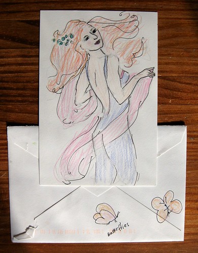
This very artistic pen pal always includes some kind of doodle or artwork on her letters, sometimes all the way down to a watercolor envelope... this time she treated me to artwork in the style of Alphonse Mucha's 1898 painting "Dance."

Under the dancing lady, you can see the lovely butterflies that adorned the envelope.